Taxes: who pays how much in eight charts
Ideological arguments about whether taxes are too high or too low miss the crucial question of who ends up bearing how much of the burden of financing our public sector.
There’s an inescapable reality surrounding that question: unlike corporations and the ultra-rich, America’s working majority have neither the lobbyists to write loopholes into the tax code, nor the financial planners and high-end tax accountants to exploit them.
The result, as economist Joseph E. Stiglitz tells Bill Moyers, is a system that is fundamentally unfair. Here are eight charts that illustrate how our tax burden has shifted over the years, and why we need to reform our tax code.
The US Is One of the Least Taxed Countries
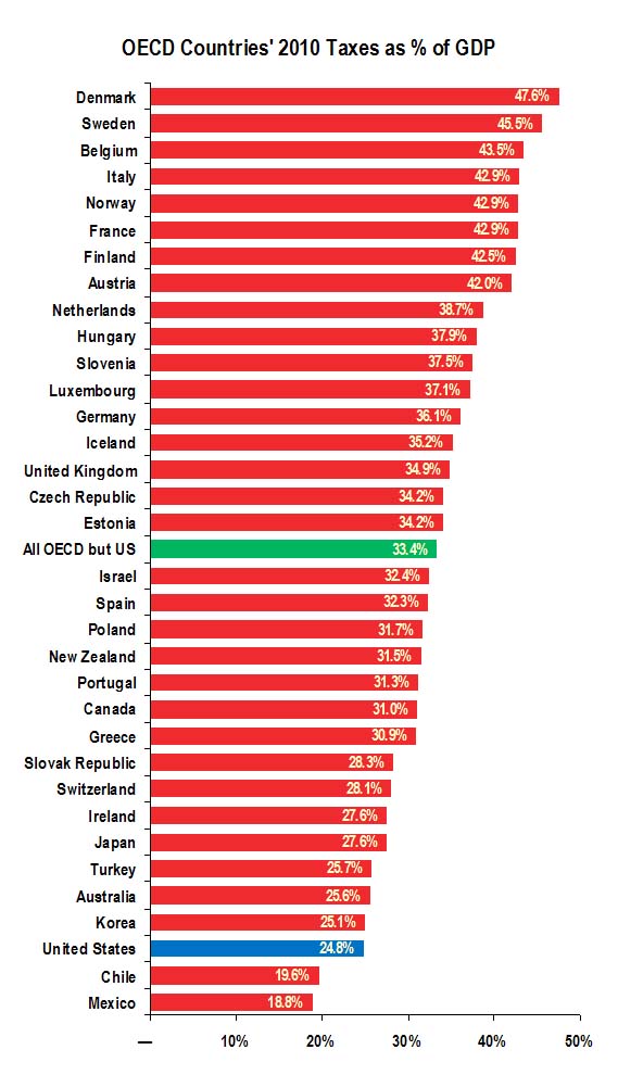
Here’s some important context: Overall, we pay relatively little in taxes today compared to other wealthy countries.
Of the 24 countries that were members of the Organization for Economic Cooperation and Development (OECD) in 1979, the US paid the 16th highest share of its economic output in taxes.
Fast-forward to 2010, and the US was the third least taxed country, ranking 32nd out of 34 OECD countries in terms of taxes as a percentage of Gross Domestic Product (GDP). As the graph below shows, only two countries, Chile and Mexico, paid less in taxes than the US did in 2010. And as the green bar shows, the 24.8 percent we forked over in taxes was significantly less than the average of 33.4 percent that the other 33 countries paid.
On the Federal Level, Corporate Taxes Are Down and Payroll Taxes Are Up
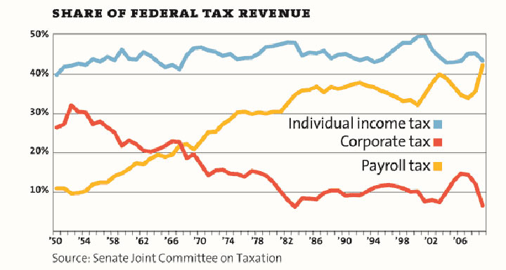
This graphic shows that since 1950 the share of federal revenues from individual income taxes has remained relatively stable. But during that same period, corporations’ share of the burden has plummeted, while the contributions from workers’ payroll taxes have dramatically increased.
That’s an important point because payroll taxes are regressive — after the first $117,000, the more money a person makes, the smaller the share of income gets deducted from his or her paycheck.
Federal tax revenue as a percentage of GDP (1950-2012) / Click here
But over that same period, since 1950, the share collected by state and local governments has almost doubled.
State and local government receipts as a percentage of GDP of GDP / Click here
Why That Matters
Perhaps you’re thinking, ‘Why does the distinction between federal taxes and state and local taxes matter? A buck is a buck.’
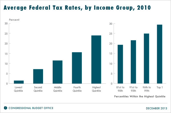
The reason it’s important is because at the federal level, those with higher incomes pay a larger share of their incomes in taxes than those who earn less, as the chart below shows.
While the richer pay a higher tax rate at the federal level, the opposite is true when it comes to state and local taxes. As the chart below shows, in 2011, America’s top earners paid a lower percentage of state and local taxes on their income, 7.9 percent, while the bottom earners paid a higher rate at 12.3 percent.
Many states’ income taxes are less progressive than the federal system, property taxes tend to be somewhat regressive and sales and “sin” taxes are very regressive. A 2013 study by the Institute on Taxation and Policy found that those kinds of consumption taxes averaged a “7 percent rate for the poor, a 4.6 percent rate for middle incomes, and a 0.9 percent rate for the wealthiest taxpayers.”
Polls consistently find that most Americans across the ideological spectrum favor the principle of progressive taxation — with the wealthier bearing a bigger piece of the burden than the middle class and the poor. Shifting federal taxes to the state and local levels makes our system less progressive overall.
State and local taxes as share of income 2011 50-state average / Click here
Who Gets the Tax Breaks?
The chart below shows the percent of all tax breaks — the myriad deductions and credits written into our tax code — given to individuals at different income levels. The Congressional Budget Office says these breaks “resemble federal spending by providing financial assistance to specific activities, entities, or groups of people.”
As you will see below, the highest income group got the lion’s share of the tax breaks, 51 percent, while the lowest income group got the least, 8 percent.
Distribution of income tax breacks, by quintily 2013 / Click here
What about the Tippy-Top?
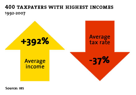
As much as we talk about income inequality and the 1 percent, the greatest inequities exist even higher in the economic stratosphere.
This chart looks only at the wealthiest 400 families. They make up about the top 1 percent of the 1 percent. While their average income increased by 392 percent between 1992 and 2007 (and most of us are thrilled when we get a cost of living increase of 3 percent), their tax rate dropped by 37 percent.
(By: Mollers Company)

