The bottom 1 percent
How is it different to be poor—very poor—in a developing country than in the richest country in the world? That’s the question asked in a new paper from Brookings researchers Laurence Chandy and Cory Smith.
To answer it, Chandy and Smith needed to know more about that very bottom of America’s wealth distribution—those living below the global poverty line of $2 per day. Not so easy: In contrast with how well-documented, how legible, the lives of the richest Americans are, those of the poorest are opaque, having fallen between the cracks in researchers’ databases. The poorest are “the least explored and understood part of the distribution.”
But that’s only true for rich countries. In the developing world, precisely the opposite is the case: In such places, they write, “tax systems are insufficiently developed to provide an accurate portrayal of the rich so the upper tail remains largely unknown; by contrast the concentration of incomes near zero means
that surveys capture the lower tail relatively well.”
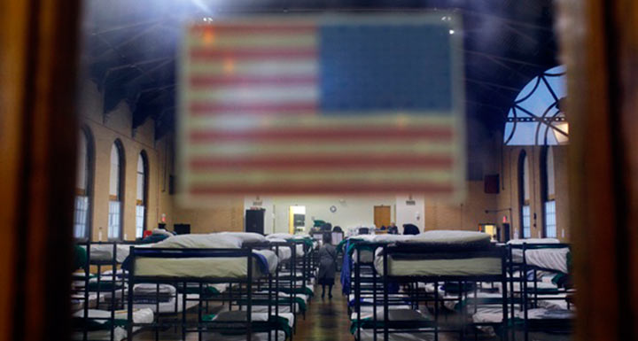
The result of this is that “we know least about the top of the distribution in poor countries and least about the bottom of the distribution in rich countries.” Unfortunately, in America, that means we have the worst understanding of “those whose lives are most precarious.”
I spoke with Chandy about their paper and why it’s so important that we improve our understanding of the dynamics of poverty in America. A lightly edited transcript of our conversation follows.
Rebecca Rosen: To start with, I know that your research typically looks at global poverty, particularly poverty in the developing world. What brought you to look at U.S. poverty? How does poverty here look to someone who spends his time thinking about poverty in much poorer countries?
Laurence Chandy: My co-author Cory Smith and I were drawn to this topic last summer after reading an excellent paper on U.S. poverty by Luke Shaefer and Kathryn Edin. Their report was the first to apply the $2 a day poverty line, a definition of poverty traditionally used in the developing world, to the U.S., and therefore to draw an analogy between the levels of destitution that prevail in these very different settings.
When Cory and I first heard about this paper, we were frankly quite dismissive. Our priors were that the depth of poverty was of an altogether different magnitude in developing countries, and that people who drew this kind of comparison were probably motivated by parochial ideas such as a desire to cut off foreign aid to poor countries. But after reading Luke and Kathryn’s paper, it was clear that this was a serious and careful piece of research by informed U.S. poverty scholars. Their paper motivated us to examine the topic ourselves, but to approach it from our perspective as analysts of global poverty.
R.R.: Can you tell readers a bit about their findings, and then how those findings look in a global context? How poor are the poorest Americans? Where do they fit in with the global picture?
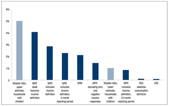
L.C.: Well, the first and most striking finding of theirs was simply that $2-a-day poverty exists in the U.S. (Note that the official U.S. poverty line works out at around $16 per person per day, so we’re talking about people living at a tiny fraction of this threshold.) Luke and Kathryn focused their attention on families with children, and estimated that between one and five percent of these families lived under the $2 threshold, depending on whether a narrow or broad (i.e., including various benefits and tax credits) definition of income is used.
If we crudely compare this one-to-five-percent range with estimates of $2 poverty in the developing world, it ranks the U.S. among various middle-income countries: countries like Russia, West Bank and Gaza, Albania, Argentina. I would stress that such a comparison is indeed crude. To make a fair comparison, you would want to use a similar methodology for measuring poverty across these different settings.
One of the things we wanted to do in our paper was to attempt a more rigorous comparison. So we took the approach used by the World Bank to estimate poverty in developing countries and tried to replicate this as faithfully as possible using data from the U.S. Most importantly, this meant using a different data source than Luke and Kathryn—a survey of reported consumption as opposed to a survey of reported income. (Luke and Kathryn’s estimates drew from the Survey of Income and Program Participation, or SIPP; to replicate the Bank’s approach, we drew from the Consumer Expenditure Survey.)
When we did this, the estimate of $2-a-day poverty dropped all the way to zero. But this still left us with lots of questions: What did the range of estimates of $2 poverty in the U.S. tell us about how poverty is manifested differently in the U.S. and the developing world? And is the methodology used by the World Bank for estimating poverty in the developing world the best way to analyze the condition of America’s poorest people?
Different Estimates of a $2-a-Day Poverty Rate
R.R.: We see a lot of articles and research on what the top one percent looks like, the top .1 percent, even the top .01 percent, but our understanding of the very bottom of the income distribution is much less differentiated. Why is that? What can we know about America’s very poorest?
L.C.: Our main tool for assessing people’s welfare is representative surveys, where we take a sample of the population, ask them lots of questions, and extrapolate their answers to estimate the condition of the population as a whole. The trouble with this approach is that it does a much better job of telling us about people nearer the middle of the distribution than about those at the extremes or “tails.”
(From the: The Atlantic)